Creating Custom Widgets
Cloudify enables you to create your own widgets to help you to orchestrate your applications in the Cloud.
Widget Development Methods
Language
We write our widgets in JavaScript. They can be created using:
ReactJS is the recommended method and requires a build operation. You must use the build system described in Building section. Code must be compatible with ReactJS v16.x. ES6 is supported in that method.
Plain JavaScript enables you to attach an HTML template file. The callbacks for this method are described later in this topic. You must create a widget package yourself. No ES6 is supported in that method.
Building
To ease widget building, you should use one of the following environments:
- Widget Development Environment - it’s quick to set it up, but you’ll have to upload your widget to Cloudify Manager after every code change.
- Cloudify Console Development Environment - it takes more time to set it up, but once you have it configured, you won’t need to upload your widget to Cloudify Manager after every change in widget’s code, because building tools running in background would update it for you.
You can find environment configuration description under above mentioned links.
Widget Directory
A widget is made up of these files:
| File | Required | Description |
|---|---|---|
widget.js |
Yes | Holds the widget definition |
widget.png |
Yes | The preview image of the widget in the widgets catalog |
backend.js |
No | A widget backend that allows widget frontend code to use backend services |
widget.html |
No | A widget template file that is relevant only when you write a widget in plain JavaScript with an HTML template |
widget.css |
No | The CSS file that the widget uses |
README.md |
No | A widget help ReadMe file in Markdown format |
Let’s say you want to create a widget my-widget.
ReactJS
If you want to write your widget in ReactJS (recommended), you must put your widget.js file
(and optionally backend.js file) into the src directory along with any other required files.
In the widget.js file, you can use import to include the additional files.
You can split the widget into a number of files. You can also use ES6 features.
In this method, the widget directory structure will look as follows:
/widgets
   /my-widget
      /src
         widget.js
         backend.js   // Optional
      widget.js       // File generated by build system
      backend.js      // Optional. File generated by build system
      widget.html     // Optional
      widget.png
      widget.css      // Optional
      README.md       // Optional
Plain JavaScript
If you use Plain JavaScript the widget directory structure looks like this:
/widgets
   /my-widget
      widget.js
      backend.js   // Optional
      widget.html  // Optional
      widget.png
      widget.css   // Optional
      README.md    // Optional
Widget Definition
Each widget.js file must have a call to the Stage.defineWidget global function.
Example
The following code demonstrates how easy it is to create a simple widget.
You can copy this code and put it in a widget.js file to produce a fully working widget.
See the previous section for the directory structure guidelines.
Stage.defineWidget({
    id: 'my-widget',
    name: 'My Widget',
    description: 'This widget displays "Hello World!" text',
    isReact: true,
    categories: [Stage.GenericConfig.CATEGORY.OTHERS],
    permission: Stage.GenericConfig.CUSTOM_WIDGET_PERMISSIONS.CUSTOM_ALL,

    render: function(widget, data, error, toolbox) {
        return (
            <span>Hello World!</span>
        );
    }
});
Widget Settings
As seen in the example above, there are some configuration fields that you can provide when you design a widget.
The Stage.defineWidget function receives a settings object with the options described in this table.
| Option | Type | Required | Default | Description |
|---|---|---|---|---|
categories |
array | No | ['Others'] |
This property specifies in which categories this widget is shown. It can take an array containing one or more of the values defined in Stage.GenericConfig.CATEGORY object: BLUEPRINTS (‘Blueprints’ category), DEPLOYMENTS (‘Deployments’), BUTTONS_AND_FILTERS (‘Buttons and Filters’), CHARTS_AND_STATISTICS (‘Charts and Statistics’), EXECUTIONS_NODES (‘Executions/Nodes’), SYSTEM_RESOURCES (‘System Resources’), OTHERS (‘Others’), ALL (‘All’). |
color |
string | No | blue |
The color of the widget. One of the following: red, orange, yellow, olive, green, teal, blue, violet, purple, pink, brown, grey or black. |
description |
string | No | - | Description of the widget that is displayed in the Add Widget dialog. |
fetchUrl |
string/object | No | - | If fetchUrl exists, the data from the URL is fetched by the application and passed to the render and postRender methods. To fetch multiple URLs, you must pass an object where the key is a name you select for this data, and the value is the URL. It is important to note that the render is called once before the data is fetched (to enable information about loading or partial data can be displayed) and once after the data is fetched. |
hasReadme |
boolean | No | false |
Whether to use README.md file. File must be present in widget’s main directory. If helpUrl is defined and hasReadme is set to true, then helpUrl is used. |
hasStyle |
boolean | No | false |
Whether to use style.css file. File must be present in widget main directory. |
hasTemplate |
boolean | No | false |
Whether to use widget.html file as template. File must be present in widget main directory. |
helpUrl |
string | No | - | URL to help webpage. If helpUrl is defined and hasReadme is set to true, then helpUrl is used. |
id |
string | Yes | - | The ID of the widget definition. Must match the name of the directory into which it is placed. |
initialConfiguration |
array | No | [] |
A list of widget configuration options. The options are displayed when a user clicks the Configure icon in the top-right corner of the widget in edit mode. |
initialHeight |
string | No | 12 |
The default height of the widget when added to a page. |
initialWidth |
string | No | 3 |
The default width of the widget when added to a page. |
isReact |
boolean | Yes | - | Set as true when writing a React widget. |
name |
string | Yes | - | The display name of the widget that is displayed in the Add Widget dialog. It is also used as the default widget name. |
showBorder |
boolean | No | true |
Whether to display border of the widget. |
showHeader |
boolean | No | true |
Whether to display a header. If a header is not displayed, a user cannot change the widget name. |
permission |
string | Yes | - | This property specifies which user can later access and view this widget. It can take one of the following three values defined in Stage.GenericConfig.CUSTOM_WIDGET_PERMISSIONS object: CUSTOM_ADMIN_ONLY (applies for ‘sys_admin’ and ‘manager’ roles), CUSTOM_SYS_ADMIN_ONLY (applies for ‘sys_admin’ only, CUSTOM_ALL (applies to all user-roles). |
initialConfiguration
initialConfiguration supports 4 generic pre-made configuration fields:
Stage.GenericConfig.POLLING_TIME_CONFIG(int)- How often to refresh the data (in seconds)Stage.GenericConfig.PAGE_SIZE_CONFIG(int)- The initial number of rows (page size) for widgets presenting data in tabular view. If value not provided, then page size is set to 5Stage.GenericConfig.SORT_COLUMN_CONFIG(string)- Column name to sort byStage.GenericConfig.SORT_ASCENDING_CONFIG(boolean)- Change sorting order (true=ascending)
In addition to listed above, you can create your own configuration fields. Example of configuration with user-defined fields:
    initialConfiguration: [
        Stage.GenericConfig.PAGE_SIZE_CONFIG(3),
        {id: 'username', name: 'Fetch with', placeHolder: "GitHub user", description: "...", default: "cloudify-examples", type: Stage.Basic.GenericField.STRING_TYPE},
        {id: 'filter', name: 'Filter', placeHolder:"GitHub filter", description: "...", default: "blueprint in:name NOT local", type: Stage.Basic.GenericField.STRING_TYPE},
        {id: "displayStyle", name: "Display style", items: [{name:'Table', value:'table'}, {name:'Catalog', value:'catalog'}], default: "catalog", type: Stage.Basic.GenericField.LIST_TYPE},
        Stage.GenericConfig.SORT_COLUMN_CONFIG('created_at'),
        Stage.GenericConfig.SORT_ASCENDING_CONFIG(false)
    ]
Full list of available configuration field types (value of type property) you can in the GenericField component documentation).
Configuration fields values can be fetched in render method using widget.configuration object. See Accessing data in render() for details.
fetchUrl
There are two primary ways of pulling data from remote sources: fetchUrl and fetchData().
fetchUrl is an object member and may be defined either as a string or an object with multiple string properties (property:URL) where each property represents a separate URL to query.
Single URL
A single URL results are available directly in the data object.
fetchUrl:  'localhost:50123/public/nodes'
// ...
render: function(widget, data, error, toolbox) {
    let your_data = data;
    //...
}
Mulitple URL
In case fetchUrl is defined with multiple URLs, the results are accessible by the property name of this URL (i.e. data.nodes).
fetchUrl: {
    nodes: '[manager]/nodes?_include=id,deployment_id,blueprint_id,type,type_hierarchy,number_of_instances,host_id,relationships,created_by[params:blueprint_id,deployment_id,gridParams]',
    deployments: '[manager]/deployments?_include=id,groups[params:blueprint_id,id]'
}
// ...
render: function(widget, data, error, toolbox) {
    let nodes = data.nodes.items;
    let deployments = data.nodeInstances.items;
    //...
}
As seen in the example above, URLs provided in fetchUrl can be parametrized with several special tokens:
fetchUrl: '[manager]/executions?is_system_workflow=false[params]'
- The
[manager]token is replaced with the current Cloudify Console backend IP address and call is forwarded to Cloudify Manager’s REST API. - The
[backend]token is replaced with the current Cloudify Console backend IP address. - The
[params]token, on the other hand, is quite special. This placeholder can be expanded into a number of things depending on usage:[params]alone anywhere in the URL is expanded to default pagination parameters (_size,_offset,_sort) if available (seeinitialConfiguration). This mode is inclusive - all params available in the widget is appended to URL.[params:param_name1(,param_name2)]is replaced with “¶mName1:paramValue1” in the URL. Please note that this can be used both to selectively pick pagination parameter as well as custom parameters (seefetchParams()). This mode is exclusive - parameters not specified explicitly are skipped. When using selective param picking ([params:param_name]) you can use a pre-definedgridParamstag to include all pagination parameters (_size,_offset,_sort) instead of specifying explicitly each of the three.
fetchUrl - Inclusive Params
The following example illustrates fetchUrl with both tokens along with their URL:
initialConfiguration: [
    Stage.GenericConfig.POLLING_TIME_CONFIG(60),
    Stage.GenericConfig.PAGE_SIZE_CONFIG(),
    Stage.GenericConfig.SORT_COLUMN_CONFIG('column_name'),
    Stage.GenericConfig.SORT_ASCENDING_CONFIG(false)
],
fetchUrl: {
    nodes: '[manager]/nodes[params]'
},
fetchParams: function(widget, toolbox) {
    return {
        sampleFuncParam: 'dummy'
    }
}
Result URL: http://
This url can be divided into 3 separate parts:
| Field | Example | Description |
|---|---|---|
| manager address | http:// |
The internal value of Cloudify Manager [manager] |
| endpoint name | nodes? | Remaining part of the REST endpoint address |
| generic params | &_sort=-column_name&_size=5&_offset=0 | Parameters that were implicitly added to request. These parameters are inferred from the GenericConfig objects in initialConfiguration and are responsible for pagination of the results. It is possible to omit them by explicitly specifying param names to be used like so [params:my-param]. Alternatively, gridParams (sort, size, offset) can be simply removed from initialConfiguration. |
| custom params | &sampleFuncParam=dummy | Custom parameters can be defined in fetchParams() function. Each custom parameter must be returned as a property of an Object returned by fetchParams() function. |
fetchUrl - Exclusive Params
The same URL, this time with explicit param names (and the gridParams tag):
initialConfiguration: [
    Stage.GenericConfig.POLLING_TIME_CONFIG(60),
    Stage.GenericConfig.PAGE_SIZE_CONFIG(),
    Stage.GenericConfig.SORT_COLUMN_CONFIG('column_name'),
    Stage.GenericConfig.SORT_ASCENDING_CONFIG(false)
],
fetchUrl: {
    nodes: '[manager]/nodes[params:sampleFuncParam,gridParams]'
//  which is essentially the same as
//  nodes: '[manager]/nodes[params:sampleFuncParam,_size,_offset_,_sort]'
},
fetchParams: function(widget, toolbox) {
    return {
        sampleFuncParam: 'dummy'
    }
}
Result URL: http://
Widget Functions
The following functions are available to be defined for custom widgets (they must be provided as properties of object passed to Stage.defineWidget function).
init()
Called when the widget definition is loaded, which occurs after the system is loaded. Can be used to define certain elements, for example classes and objects that are used in the widget definition.
render(widget, data, error, toolbox)
Called each time that the widget needs to draw itself. This can occur when the page is loaded, widget data is changed, context data is changed, widget data is fetched, and so on.
render parameters are:
- The widget object itself
- The fetched data, either using
fetchUrlorfetchData. The data isnulliffetchDataorfetchUrlis not specified. The data will also passnullto therendermethod until data is fetched. If you are expecting data, you can render a “loading” indicator. - The error if data fetching failed
- The toolbox object.
render() is focal to the appearance of the widget as the return value of this function is rendered by ReactJS engine.
As such it is important to understand how to build widgets.
The following example illustrates the simplest usage:
render: function(widget, data, error, toolbox) {
    return (
        <span>Hello World!</span>
    );
}
You can learn how to render ReactJS elements and components starting from here.
Using Ready Components In render()
Although using React DOM Elements (similar to plain HTML tags) gives you extreme flexibility, usually it is much quicker to design your widget with the use of Cloudify Console ready-made components. These components were designed with Console uniformity and ease-of-use in mind, and as are very easy to learn and use.
The following example illustrates how to use a KeyIndicator component:
render: function(widget, data, error, toolbox) {
    let {KeyIndicator} = Stage.Basic;

    return (
        <KeyIndicator title='User Stars' icon='star' number={3} />
    );
}
Notice that the KeyIndicator component is imported into the widget. It is defined in the render method as:
let {KeyIndicator} = Stage.Basic;
You can also import multiple components in the same line, for example:
let {KeyIndicator, Checkmark} = Stage.Basic;
Description of other built-in components is available here.
Accessing Data In render()
There can be several independent data sources for your widget.
Two most commonly used are the configuration and data objects.
The following example illustrates how to access both of them:
Stage.defineWidget({
    id: 'my-widget',
    name: 'My widget',
    description: 'This widget polls data from two different sources',
    isReact: true,
    initialConfiguration: [
        {id: 'confText', name: 'Conf Item',  placeHolder: 'Configuration text item', default: 'Conf text', type: Stage.Basic.GenericField.STRING_TYPE}
    ],
    permission: Stage.GenericConfig.CUSTOM_WIDGET_PERMISSIONS.CUSTOM_ALL,

    fetchData: function(widget, toolbox, params) {
        return Promise.resolve({fetchedText: 'Fetched text'});
    },

    render: function(widget, data, error, toolbox) {
        let {Loading} = Stage.Basic;

        if (_.isEmpty(data)) { // Make sure the data is already fetched, if not show a loading spinner
            return (<Loading message='Loading data...'></Loading>);
        } else {
            return (
                <div>
                    <p>confItem value: {widget.configuration.confText}</p>
                    <p>fetchedText value: {data.fetchedText}</p>
                </div>
            );
        }
    }
});
The above widget will display two lines containing the strings defined in the data sources: “Conf text” and “Fetched Text”. Please note how the widget makes sure data has been loaded has completed before rendering it. Skipping this check would result in an error in browser console.
Default value of initialConfiguration fields, as the name suggests, is only used if there are no user defined values for these properties.
A user can change them by entering the Edit Mode where he can modify widget’s configuration.
From that point, the current widget will use the value provided by the user.
To reset it to it’s default value, the widget must be removed and re-added to the page.
Moreover, please remember to remove and re-add the widget to the dashboard if changing the initialConfiguration field.
It is only loaded for newly ‘mounted’ widgets.
postRender(container, widget, data, toolbox)
Non-React widgets only.
postRender is called immediately after the widget has been made visible in the Console.
This function has access to the same objects as the render function with one addition -
the container object containing a reference to the widget’s container (parent) object.
fetchData(widget, toolbox, params)
An alternative to using fetchUrl is the fetchData() function. It provides greater flexibility when you need to pre-process
your results or chain them into nested Promises (ie. pull a list of URLs and resolve each of those URLs).
fetchData() parameters are:
- widget object
- toolbox object
- params object (see fetchParams() function)
The return value for fetchData() is expected to be a Promise.
As such if you would like to return a primitive value you would need to wrap it in a promise:
fetchData: function(widget, toolbox, params) {
    return Promise.resolve({key:value});
}
Please note that should the result be a single primitive value you still need to return it as a property of an Object, since referencing the Object directly is illegal in ReactJS. With this in mind, the following example would not work:
// THIS WILL NOT WORK
fetchData: function(widget, toolbox, params) {
    return 10;
},

render: function(widget, data, error, toolbox){
    return (
        <div>
            {data}  // This will produce a runtime error
        </div>
    )
}
Instead, you can return the int value as a property of the object like so:
fetchData: function(widget, toolbox, params) {
    return {myInt: 10};
},
render: function(widget, data, error, toolbox) {
    return (
        <div>
            {data.myInt}  // OK
        </div>
    )
}
Note: fetchUrl and fetchData() are mutually exclusive,
that is if you define fetchUrl in your widget, then fetchData() definition is ignored.
fetchParams(widget, toolbox)
fetchParams() function delivers query parameters to
fetchData()- can be accessed usingparamsargument of the function,fetchUrl- can be accessed using[params]wildcard in URL.
Example for fetchUrl:
fetchUrl: '[manager]/nodes[params]',
fetchParams: function(widget, toolbox) {
    let deploymentId = toolbox.getContext().getValue('deploymentId');

    return {deployment_id: deploymentId};
}
Example for fetchData():
fetchData: function(widget, toolbox, params) {
    return toolbox.getManager().doGet('/nodes', params);
},
fetchParams: function(widget, toolbox) {
    let deploymentId = toolbox.getContext().getValue('deploymentId');

    return {deployment_id: deploymentId};
}
Widgets APIs
The widget development tools include built-in features, widget objects, functions, templating mechanism and available libraries.
Widget Object
The widget object has the following attributes:
| Attribute | Description |
|---|---|
id |
The ID of the widget |
name |
The display name of the widget (the widget definition name is the default name for the widget, but a user can change it in Edit Mode) |
height |
The height of the widget on the page |
width |
The width of the widget on the page |
x |
The x location of the widget on the page |
y |
The y location of the widget on the page |
definition |
The widget definition object as it was passed to defineWidget method. All widget definitions are contained in the widget definition object. The only additional field that the widget can access is template, which is fetched from the HTML and added to the widget definition. |
Toolbox Object
The toolbox object enables widget to communicate with the application and other widgets.
It also provides generic tools that the widget might require.
The toolbox object provides access to the following:
Utility classes:
Context- seegetContext()methodEventBus- seegetEventBus()method
HTTP Requests classes:
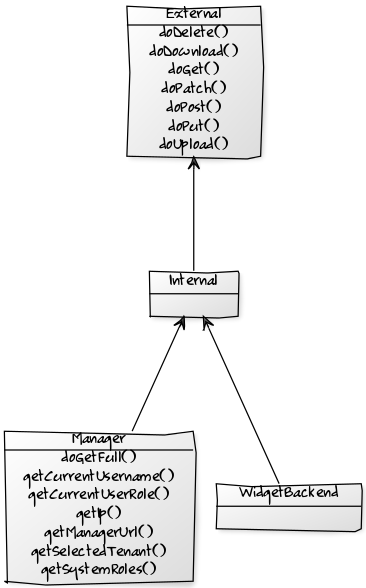
External- seegetExternal(basicAuth)methodInternal- seegetInternal()methodManager- seegetManager()orgetNewManager(ip)methodsWidgetBackend- seegetWidgetBackend()method
Hierarchy of the HTTP Requests classes is presented below:
drillDown(widget, defaultTemplate, drilldownContext)
Function used to drill down to a specific page.
Parameters
widget
It’s widget object. It is used to define drill down action originator. Widget’s ID is used during drill down page URL creation.
defaultTemplate
When you drill down to a page, you must pass the drilldownTemplate name. When a widget is on a page and you use the drilldown action (for example, in a link click event to a button) for the first time to access the page, the app creates a new page based on the passed template. When this page is created, the user can edit it like any other page. Each time the user accesses this page, the existing page is shown.
defaultTemplate is used during drill down page URL creation.
drilldownContext
You can also pass a drilldownContext to the drilldown page. This context is saved on the URL and is available through the app context.
This value is persistent, so if a user drills down to a page and then refreshes the page, the context is saved.
For example, with the selected deployment in drilldown deployment page.
When selecting a deployment we drill down to a deployment page. It looks like this:
    _selectDeployment(item) {
        this.props.toolbox.drillDown(this.props.widget, 'deployment', {deploymentId: item.id});
    }
You can see an example of the “deployment” template (used in the example) in the Cloudify Console repository in the /pages/deployment.json file.
Drilldown Page Templates
Drilldown page templates are defined in the /templates/pages directory.
Each file contains one page template configuration.
Page template configuration has a name which is the default page name, and list of widgets. Each widget have the following fields
| field | description |
|---|---|
| name | Widget default name |
| definition | The ID of the widget to use |
| width | The initial width of the widget on the page |
| height | The initial height of the widget on the page |
| x | The initial x location of the widget on the page |
| y | The initial y location of the widget on the page |
| configuration | The initial configuration of the widget (Optional) |
If x and/or y are not defined the page is auto arranged (not recommended)
For example:
{
  "name": "template-name",
  "widgets": [
    {
      "name": "Deployments",
      "definition": "deployments",
      "width": 12,
      "height": 24,
      "x": 7,
      "y": 35,
      "configuration": {
        "displayStyle":"list"
      }
    },
    ...
  ]
}
getContext()
A widget context gives access to the application context. Using the context we can pass arguments between widgets, for example when a blueprint is selected, set the context to the selected blueprint, and all the widgets that can filter by blueprint can read this value and filter accordingly.
The context supports these methods:
setValue(key, value)- sets value in contextgetValue(key)- returns value from context
getEventBus()
Used to register (listen to) and trigger events. The event bus is used to enable a widget to broadcast an event,
usually a change that it made that affect others. For example, if a blueprints widget creates a new deployment,
other widgets need to be aware that the the deployment list has changed. The listening widgets then call a refresh.
Event bus supports the following methods:
on (event, callback, context)trigger (event)off (event, offCallback)
For example:
componentDidMount() {
    this.props.toolbox.getEventBus().on('deployments:refresh', this._refreshData, this);
}
componentWillUnmount() {
    this.props.toolbox.getEventBus().off('deployments:refresh', this._refreshData);
}
_deleteDeployment() {
    // Do somehting...
    actions.doDelete(deploymentToDelete).then(() => {
        this.props.toolbox.getEventBus().trigger('deployments:refresh');
    }).catch((err) => {
        // Handle errors...
    });
}
getExternal(basicAuth)
Used to access external URLs allowed by Cloudify Console. To access other external URLs, you should use Widget backend feature.
If you provide basicAuth parameter, then in all HTTP requests ‘Authorization’ header is set with ‘Basic
Available methods:
doGet(url, params, parseResponse, headers)
doPost(url, params, data, parseResponse, headers, withCredentials)
doDelete(url, params, data, parseResponse, headers)
doPut(url, params, data, parseResponse, headers)
doPatch(url, params, data, parseResponse, headers)
doDownload(url, fileName)
doUpload(url, params, files, method, parseResponse=true)
Parameters:
url- string, containing URLparams- object, query string parameters passed in object, eg.{myParam: 'myValue'}data- object, request bodyparseResponse- boolean, if set to true, then response is parsed to JSONheaders- object, headers to be passed to request, eq.{"authentication-token": "jfcSvxDzy8-Fawsie"}fileName- name of the file for the downloaded file
We recommend that you use fetchData() instead of doGet(URL, params) since fetchData() not only utilizes doGet() but also gives easy access to helper params.
getInternal()
Returns Internal object (all capabilities of External object described above) to make internal HTTP requests on secured connection.
URLs passed to Internal object methods are prepended with context path: /console.
To all requests the following headers are added:
- Authentication-Token header with current token value,
- tenant header with current selected tenant name.
getManager()
Returns Manager object (extends capabilities of Internal object described above).
Used either to make HTTP requests (see External object methods above) to Cloudify Manager REST API or to read Manager’s properties:
Cloudify Manager REST API HTTP request example:
return this.toolbox.getManager().doDelete('/deployments/${blueprint.id}');

doUpload(blueprintName, blueprintFileName, file) {
    return this.toolbox.getManager().doUpload('/blueprints/${blueprintName}',
                                              _.isEmpty(blueprintFileName)
                                                ? null
                                                : {application_file_name: blueprintFileName+'.yaml'},
                                              file);
}
Cloudify Manager REST API documentation can be found here.
As you can see in the above example in URL parameter you don’t have to provide /api/vX.X portion.
Available methods for getting Cloudify Manager properties:
getIp()
getCurrentUsername()
getManagerUrl(url, data)
getApiVersion()
getSelectedTenant()
doGetFull(url, params, parseResponse, fullData, size)
getNewManager(ip)
Returns Manager object connected on the specified IP.
May be needed in order to join a different manager (eg. for cluster joining).
getWidgetBackend()
Returns WidgetBackend object (all capabilities of Internal object described above).
It allows you to make HTTP requests on previously defined widget backend endpoints (see Widget backend section for details).
getWidgetDefinitionId
Returns widget ID (see widget object).
goToHomePage
Redirects user to home page.
goToPage(pageName)
Redirects user to page with ID (URL alias) passed in pageName argument.
goToParentPage
Redirects user to parent page (used when you are in drill-down page).
loading(boolean)
Shows/hides a loading spinner in widget header.
Not allowed in render() and postRender() methods as it changes store state leading to render() and postRender() re-run.
refresh()
If we did some actions in the widget that require fetching the data again (for example we added a record) we can ask the app to refresh only this widget by calling refresh().
External Libraries
The external libraries available to a widget are: moment, jQuery, Lodash and markdown-js.
moment - Date/Time parsing utility. Moment documentation
for example:
var formattedData = Object.assign({},data,{
    items: _.map (data.items,(item)=>{
        return Object.assign({},item,{
            created_at: moment(item.created_at,'YYYY-MM-DD HH:mm:ss.SSSSS').format('DD-MM-YYYY HH:mm'),
            updated_at: moment(item.updated_at,'YYYY-MM-DD HH:mm:ss.SSSSS').format('DD-MM-YYYY HH:mm'),
        })
    })
});
jQuery - Feature-rich JS library. jQuery API
for example:
postRender: function(el,widget,data,toolbox) {
    $(el).find('.ui.dropdown').dropdown({
        onChange: (value, text, $choice) => {
            context.setValue('selectedValue',value);
        }
    });
})
Lodash - Modern JavaScript utility library delivering modularity, performance & extras. Lodash documentation
for example:
_.each(items, (item)=>{
    //...
});
markdown-js - JavaScript Markdown parser. markdown-js documentation
for example:
let content = "An h1 header\n" +
              "============\n" +
              "\n" +
              "Paragraphs are separated by a blank line.\n" +
              "\n" +
              "2nd paragraph. *Italic*, **bold**, and `monospace`. Itemized lists\n" +
              "look like:\n" +
              "\n" +
              "  * this one\n" +
              "  * that one\n" +
              "  * the other one\n";
let readmeContent = markdown.parse(content);
Widget Backend
With widget backend support user can create HTTP endpoints in Console backend. They allow to define specific actions when endpoint is called. There can be used helper services not available in widget frontend.
Security Aspects
- Endpoint is accessible only from the widget which created that endpoint.
- Access to external libraries can be limited to preconfigured set of libraries.
Defining Endpoints
To create endpoint per widget you need to create backend.js file with at least one endpoint definition. That file must be placed in widget main folder similarly to widget.js file.
backend.js file structure
Example of backend.js file is presented below:
module.exports = function(r) {

    r.register('manager', 'GET', (req, res, next, helper) => {
        let _ = require('lodash');
        let jsonBody = require('body/json');
        let url = req.query.endpoint;
        let params = _.omit(req.query, 'endpoint');
        let headers = req.headers;

        jsonBody(req, res, function (error, body) {
            helper.Manager.doPost(url, params, body, headers)
                .then((data) => res.send(data))
                .catch(next);
        })
    });
}
backend.js file should export a function taking one argument (r in example). This function’s body contains calls to register method (r.register in example). Each call registers HTTP endpoint in the backend.
Syntax of register method:
function register(name, method, body)
where
name- String with HTTP endpoint name on which service is registered,method- String with HTTP endpoint method on which service is registered,body- Function (function(req, res, next, helper)) to be called on request to this endpoint, where:req, res, next- Part of middleware function (see Using middleware @ ExpressJS for details)helper- JSON object containing Helper services.
Helper Services
In this section helper services, which can be used from helper object in endpoints body are described.
Manager
Available methods:
call(method, url, params, data, headers={})- Performs HTTP request to Cloudify ManagerdoGet(url, params, headers)- Performs HTTP GET request to Cloudify ManagerdoPost(url, params, data, headers)- Performs HTTP POST request to Cloudify ManagerdoDelete(url, params, data, headers)- Performs HTTP DELETE request to Cloudify ManagerdoPut(url, params, data, headers)- Performs HTTP PUT request to Cloudify ManagerdoPatch(url, params, data, headers)- Performs HTTP PATCH request to Cloudify Manager
where:
method- HTTP methods (allowed methods: ‘GET’, ‘POST’, ‘DELETE’, ‘PUT’, ‘PATCH’)url- Manager REST API URL (eg.blueprints, see Cloudify REST API documentation for details)params- JSON object with URL parameters (key is parameter name, value is parameter value, eg.{param1: 'value1', param2: 'value2'}) (Optional)data- JSON object with request body (Optional)headers- JSON object with request headers (Optional)
Request
Available methods:
call(method, url, params, data, parseResponse=true, headers={})- Performs HTTP requestdoGet(url, params, parseResponse, headers)- Performs HTTP GET requestdoPost(url, params, data, parseResponse, headers)- Performs HTTP POST requestdoDelete(url, params, data, parseResponse, headers)- Performs HTTP DELETE requestdoPut(url, params, data, parseResponse, headers)- Performs HTTP PUT requestdoPatch(url, params, data, parseResponse, headers)- Performs HTTP PATCH request
where:
method- HTTP methods (allowed methods: ‘GET’, ‘POST’, ‘DELETE’, ‘PUT’, ‘PATCH’)url- HTTP URL (eg.http://example.com)params- JSON object with URL parameters (key - parameter name, value - parameter value, eg.{param1: 'value1', param2: 'value2'}) (Optional)data- JSON object with request body (Optional)parseResponse- boolean value informing if response shall be parsed as JSON (Optional)headers- JSON object with request headers (Optional)
Calling Endpoints
Previously defined endpoints can be accessed in widget frontend using toolbox.getWidgetBackend() method (see getWidgetBackend() for details).
Example of calling endpoint status with GET method widget.js:
Stage.defineWidget({
    // ... all stuff necessary to define widget ...

    fetchData: function(widget, toolbox, params) {
        return toolbox.getWidgetBackend().doGet('status')
            .then((data) => Promise.resolve({status: data}))
            .catch((error) => Promise.reject('Error fetching status. Error: ' + error));
    },

    render: function(widget,data,error,toolbox) {
        let status = data ? data.status : 'unknown';
        return (
            <p>
                Status: <b>{status}</b>
            </p>
        );
    }
});
The status endpoint for GET method must be defined in backend.js file:
module.exports = function(r) {
    r.register('status', 'GET', (req, res, next, helper) => {
        res.send('OK');
    });
}
Widget Template
The widget template is an html file written with lodash template engine.
Widget template if fetched when the widget definition is loaded, and its passed to the render function. To access it use widget.definition.template.
To render the template using the built in lodash templates engine use _.template(widget.definition.template)(data);, where ‘data’ is any context you want to pass on to the template.
For example, a simple render function looks like this:
render: function(widget,data,toolbox) {
    if (!widget.definition.template) {
        return 'missing template';
    }
    return _.template(widget.definition.template)();
}
Useful Links
- Cloudify UI @ GitHub - Git repository with Cloudify Console source code
- Cloudify UI Widgets Boilerplate @ GitHub - Git repository containing widget development environment
- Widget Components API Reference - Auto-generated documentation of Cloudify built-in React components which can be used in custom widgets