References
| summary | ||
| public |
Checkmark component shows a simple checkbox (read only) |
|
| public |
CopyToClipboardButton component shows a simple copy icon and on click action it copies prop - text to clipboard |
|
| public |
C Dropdown Dropdown is a component which extends Dropdown component from Semantic-UI-React framework. |
|
| public |
EditableLabel component shows an editable label. |
|
| public |
ErrorMessage is a component which uses Message component from Semantic-UI-React to display error message. |
|
| public |
ExecutionStatus is a component which shows execution status as icon with optional status and workflow ID strings. |
|
| public |
HighlightText component displays code with language-specific keyword highlighting |
|
| public |
KeyIndicator - a simple component showing a counter along with an icon |
|
| public |
C Loading Loading is a component which uses Loader component from Semantic-UI-React to display loader in center of parent component. |
|
| public | ||
| public |
NodeFilter - a component showing dropdowns for filtering blueprints, deployments, nodes and nodes instances. |
|
| public |
NodeInstancesFilter - a component showing dropdown with nodes instances of specified deployment. |
|
| public |
NodesTree is a tree component, it wraps rc-tree component. |
|
| public |
ParameterValue is a component which shows parameters (e.g. |
|
| public |
C Popup Popup is a component which wraps Popup used to display additional information popup. |
|
| public |
PopupHelp is a component which uses Popup component to display help popup |
|
| public | ||
| public |
ResourceVisibility - an icon representing resource visibility. |
|
| public |
RevertToDefaultIcon is a component showing undo icon. |
|
| public |
TimeFilter is a component showing time range |
|
| public |
TimePicker is a component showing datetime picker |
|
| public |
VisibilityField - allowing the user to choose visibilities for resources by showing the visibility icon and clicking on it to switch. |
|
| public |
VisibilityIcon - a component showing an visibility icon depending on resource visibility. |
|
dataSegment
| summary | ||
| public |
DataSegment component enables fetching data using predefined function and showing segmented data in a simple manner. |
|
| public |
SegmentAction is a component showing action bar including buttons displayed above the segments |
|
| public |
SegmentItem is a component showing content item for DataSegment component |
|
dataTable
| summary | ||
| public |
DataTable component enables fetching data using predefined function and showing tabular data in a simple manner. |
|
| public |
Defines action bar including buttons which are displayed above the table |
|
| public |
Defines table columns, renders <th> elements. |
|
| public |
Defines content of expandable row in data table. |
|
| public |
Defines filter bar including filter fields which are displayed above the table |
|
| public |
C TableRow Defines table rows, renders <tr> elements. |
|
| public |
Defines expandable row in data table. |
|
form
| summary | ||
| public |
ColorPicker is a component showing CompactPicker component from react-color library |
|
| public |
C EdiTable EdiTable is a component used in forms to get tabular data input |
|
| public |
C Form Form is a component to present HTML forms |
|
| public |
FormCheckbox is just a wrapper of Semantic-UI-React's Checkbox component to add help description near Checkbox label. See Checkbox Access
Usage
|
|
| public |
FormDivider is a component to divide form fields using horizontal line in Form component |
|
| public |
FormField is a component to present field and is used in Form component |
|
| public | ||
| public |
GenericField is a generic component which can be used as different input fields in Form component |
|
| public |
InputDate is a component showing calendar picker using react-datepicker library |
|
| public |
InputJson is a component providing text or rich editor for JSON-like data |
|
| public |
InputTime is a component showing time picker in form of hours/minutes input field |
|
| public |
InputUrlOrFile is a component showing URL and file input field |
|
graphs
modal
| summary | ||
| public |
C Alert Alert is component to present simple message in modal window with OK button. |
|
| public |
C Confirm Confirm is a wrapper component to present simple Yes/No confirmation modal window. |
|
| public |
ApproveButton is a component to present confirmation button in Modal component. |
|
| public |
CancelButton is a component to present cancellation button in Modal component. |
|
| public |
ReadmeModal is a component to present HTML content in Modal component. |
|
wizard
| summary | ||
| public |
StepContent component is interface for components implementing step content for WizardModal |
|
| public |
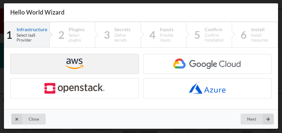
WizardModal component allows you to present step-by-step process in modal window providing convenient way to navigate between steps and store step's data during the process. Steps have to be constructed using createWizardStep function. Access
Usage
|
|
| public |
F createWizardStep(id: string, title: string, description: string, ContentComponent: React.Component, ActionsComponent: React.Component): {id: string, title: string, description: string, Content: React.Component, Actions: React.Component} Function creating step object. |
|
 Manual
Reference
Source


