Topology
Displays the topology of the blueprint or the deployment currently set in the context.
See notes for more information on resource context.

Features
Presentation
Each of the blueprint’s nodes is displayed as a square container that can contain other nodes. Each node has a name, and an icon (upper right corner) to indicate its node type.
Relationships between nodes are indicated with arrows that start at the connected node and end at the target node.
The number of node instances is marked in a bullet beside the node’s type icon.
Each node is provided with an icon (top left corner). For built-in node types it is the Cloudify logo. For node types coming from plugins it is an icon selected during plugin upload (setting plugin icon is optional, by default a plug icon is used). See Plugins widget or Plugins Catalog widget for more details.
For Component nodes you can also see bottom right corner icons showing all plugins used by the component’s internal nodes.
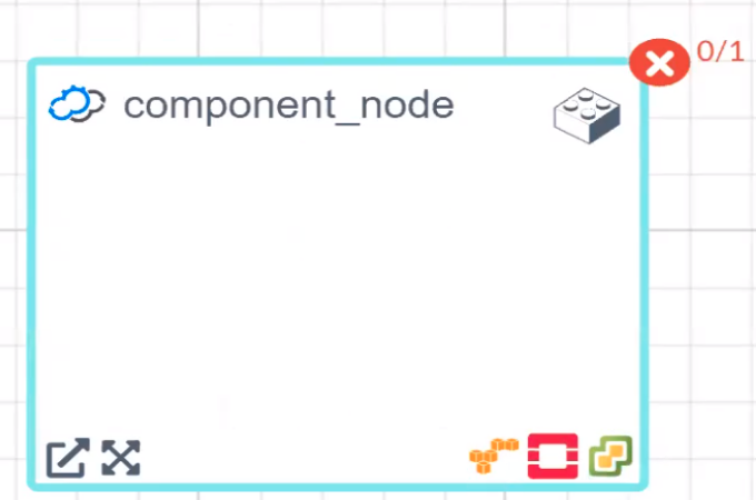
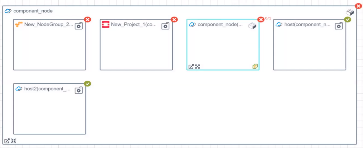
Node types used in service composition are displayed in special way which allows user to expand it (display internal nodes) or drill-down to deployment (opens node’s deployment page).
Actions
In Topology widget you can:
- Pan around the view (drag’n’drop outside node)
- Change location of the nodes (drag’n’drop inside node)
- Zoom in/out (using mouse wheel)
There is also a toolbar in the right upper corner:

It allows you to make changes in the view:
- Zoom in the topology
- Zoom out the topology
- Fit topology to screen
- Save layout - save location of the nodes (the location is saved per blueprint per user)
- Revert layout changes - revert the location of the nodes to the previous state
- Auto layout - automatically distribute the nodes on the canvas
Terraform support
Terraform nodes created using Terraform plugin are treated in a special way. There are dedicated action icons in the bottom left corner of such nodes:
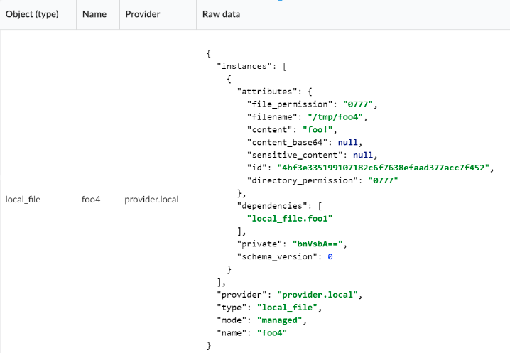
- Info - shows Terraform node details in tabular view
- Expand / Collapse - opens/closes a view of the Terraform embedded topology, similar to the views presented for Component and SharedResource nodes.
Terraform node collapsed:
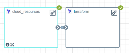
Terraform node expanded:

Terraform node info table:
Badges
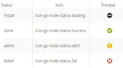
When executing a workflow for a deployment (e.g. the install workflow), the topology nodes show badges that reflect the workflow execution state.
- Install state - The workflow execution is in progress for this node
- Done state - The workflow execution was completed successfully for this node
- Alerts state - The workflow execution was partially completed for this node
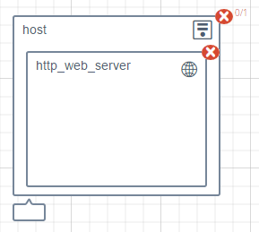
- Failed state - The workflow execution failed for this node
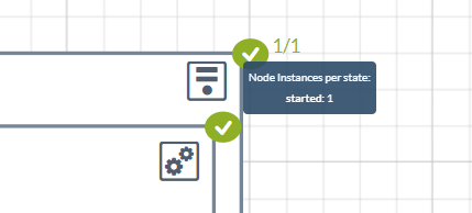
When you hover over the badge and the topology is displayed for specific deployment (not a blueprint), then you will see summary of node instances states related to specific node:
Workflow states represented by badges
-
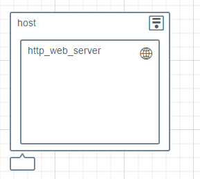
A deployment before any workflow was executed
-
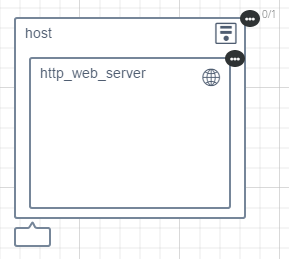
A deployment with a workflow execution in progress
-
A deployment with a workflow execution in progress, partially completed
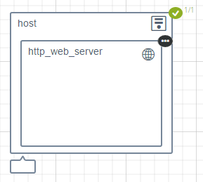
-
A deployment with a workflow execution completed successfully
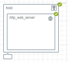
-
A deployment with a workflow execution partially completed successfully with some alerts
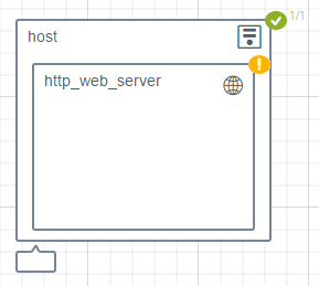
-
A deployment with a workflow execution that partially failed
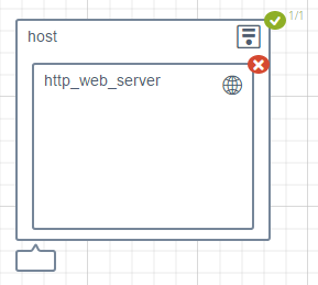
-
A deployment with a workflow execution that failed
Settings
Refresh time interval- The time interval in which the widget’s data will be refreshed, in seconds. Default: 10 seconds.
The following settings allow changing the presentation of the widget in different aspects, and are by default marked as “on”:
Enable node clickEnable group clickEnable zoomEnable dragShow toolbar
