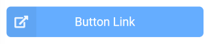
Button link
Opens the specified URL:
- in a separate tab/window if URL starts with ‘http’
- in the same tab/window in other case
You can define the button styling in widget configuration.
Settings
URL address - The URL to be opened upon clicking on the button. Default: “Label - The label displayed in the button. Default: ‘Button Link’Color - The color of the button. Available colors list can be found
at: Theming - Semantic UI React. Default: ‘green’Icon - Name of the icon displayed in the button. Available icons list can be found
at: Icon - Semantic UI React. Default: ‘external’Basic button - Allows to change button appearence, basic button is less pronounced. Default: NoFull height - Stretches the button vertically to fill entire widget’s height. Default: No